Calligraphy Layout Basics: Centering, Margins and Line Breaks
Plan a page before you ink it: thumbnail sketches, a full-size pencil draft, margins, line breaks, line spacing and a simple midpoint method for centering every line.
Practice at a glance
What you need
- Pencil and ruler
- Scrap paper for drafts
- Soft eraser
- Final sheet of smooth paper
- Your usual pen
Most layout problems are decided before the pen touches the page. A line starts too far right and has to be squeezed, or the last words run out of room and crowd the bottom edge. Good calligraphy layout is mostly planning: you find out how much space the words need, and then you give them that space on purpose.
The steps below use a pencil, a ruler and a few minutes of drafting. They work for a short phrase on a card and for several lines on a larger sheet.
Start with thumbnail sketches
A thumbnail is a tiny drawing of the page, about the size of a matchbox, with each line of text shown as a simple bar. It takes seconds, so you can compare several arrangements before you commit to one.
Draw three or four small rectangles in the proportions of your paper. In each, try a different arrangement: all lines starting at the left, all lines centered, or one short line made larger than the others. Long bars stand for long lines and short bars for short ones.
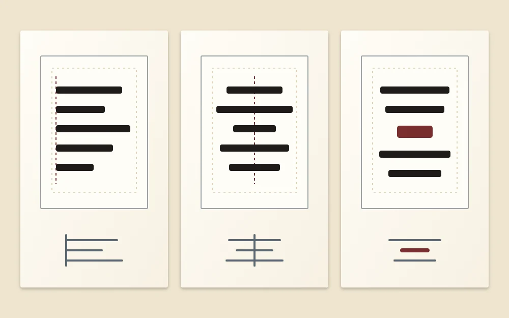
Pick the thumbnail whose shape looks balanced, with no line much longer than the rest and no lonely single word at the end.
Draft the text at full size
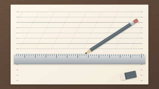
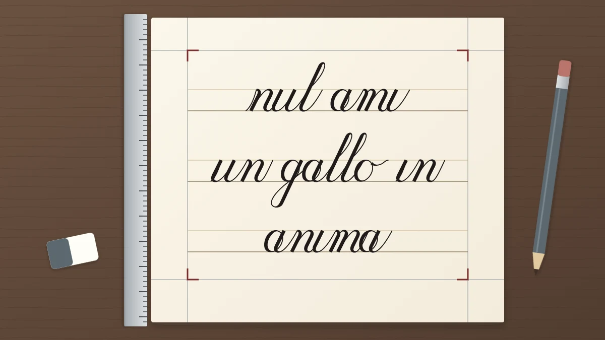
Thumbnails show shape, not length. To know how long each line really is, rule a few rows at your working x-height on scrap paper and write every line in pencil, in your usual script and at your usual pace. The guide to ruling your own practice lines covers the lines themselves.
Measure each drafted line from its first stroke to its last and write the length beside it. These numbers drive every later decision. If you need words to plan with, any of the short practice phrases written for beginners will do.
Choose flush left or centered
There are two arrangements worth learning first.
- Flush left: every line starts on the same vertical pencil line. It is the easier option, because you only need to know that the longest line fits. It suits longer texts, notes and anything informal.
- Centered: every line is balanced on a vertical center line. It looks more formal and suits cards and short pieces, but each line needs its own starting point, so it depends on accurate drafts.
Set generous margins
Margins are the frame of the piece, and beginners almost always make them too small. A common convention is to keep the top and side margins equal and make the bottom margin a little wider, which stops the text from looking as if it is sliding down the page.
Here is a worked example on a sheet 8 in wide and 10 in tall (about 20 x 25 cm), with margins of 1.5 in at the top and sides and 2 in at the bottom:
| Text area | Sheet minus margins | Result |
|---|---|---|
| Width | 8 − 1.5 − 1.5 | 5 in (about 12.7 cm) |
| Height | 10 − 1.5 − 2 | 6.5 in (about 16.5 cm) |
Mark the margins with light pencil lines. If your longest drafted line is wider than the 5 in text area, you have three options: break the line, lower the x-height, or use a larger sheet. Narrowing the margins should be the last resort.
Break lines by meaning and by length
A line break is a small pause, so place it where a reader would naturally breathe. Keep words that belong together on the same line, and avoid ending a line on a small word such as “the” or “of” when it clearly belongs to what follows.
Then look at the lengths. Take the phrase “a calm morning line written slowly before the day begins”. Broken as “a calm morning line / written slowly / before the day begins”, each line is a complete thought and the lengths form a pleasant long, short, long pattern. Broken after “written”, the second line is a single stranded word.
Set the line spacing
Line spacing is the distance from one baseline to the next. Too little, and the descenders of one line tangle with the ascenders of the line below.
Suppose your x-height is 6 mm (about 1/4 in), with ascender and descender spaces of 6 mm each. A baseline-to-baseline distance of three x-heights, 18 mm, makes a descender just touch the ascender line of the next row. Four x-heights, 24 mm, leave a clear 6 mm between them, which is a safer start.
At that spacing, three lines measure 66 mm (about 2 5/8 in) from the first ascender line to the last descender line: 18 mm for the first line plus 24 mm for each of the two that follow. That fits easily inside the 6.5 in text area, and the height that is left over is shared above and below the block.
Tip
Look at your draft for collisions before you fix the spacing. If a g sits directly above an h, you can open the line spacing a little, or move the break by one word so the two letters no longer meet.
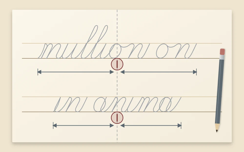
Center each line with the midpoint method
Centering by eye usually drifts to the right, because you start too far left “to be safe” and then run long. Measuring removes the guesswork.
- Draw a light vertical center line down the page. On the 8 in sheet, it sits 4 in from either edge.
- Halve the measured length of each drafted line and mark that midpoint on the draft with a small tick.
- Work out the starting point. A line 3.5 in long extends 1.75 in to each side of the center, so it begins 2.25 in from the left edge of the sheet.
- Mark the start and end of every line on its baseline with faint pencil dots.
Check the plan before you ink
Lightly pencil the whole text in position and prop the sheet upright a few steps away. Squint at it. You are looking at the shape of the block and the white space around it, not at the letters. Adjust anything that leans, crowds or floats, and only then pick up the pen.
Once this feels routine, try a small finished piece. The worked example in how to lay out a short quote takes the same steps and adds one emphasized word.
Frequently asked questions
Why does my writing always end up crowded on the right side?
Usually because the line was started without knowing its length. Write the line in pencil on scrap paper at full size, measure it, and mark where it should begin and end on the final sheet. With both ends marked, you can see early whether you are running long and adjust.
How wide should the margins be on a calligraphy piece?
There is no fixed figure, but wider than feels natural is a good rule of thumb. Many people keep the top and side margins equal and make the bottom one somewhat wider. On a sheet 8 by 10 inches, margins of about 1.5 inches with 2 inches at the bottom are a reasonable start.
Is flush left or centered better for a beginner?
Flush left is easier, because every line starts on the same pencil line and only the longest line has to fit. Centered text looks more formal but needs a measured draft of each line. Start with flush left for longer texts and try centering on short pieces of two or three lines.