How to Lay Out a Short Quote in Calligraphy
A worked example that takes a short saying in your own words from loose text to a finished page: key word, line breaks, two sizes, thumbnails, pencil draft and inking.
Practice at a glance
What you need
- Smooth paper for the final piece
- Scrap paper for drafts
- Sharp pencil and ruler
- Soft eraser
- Your usual pen and ink
A short saying on a single sheet is a natural first finished piece. It is small enough to complete in an afternoon and long enough to need a plan. A good calligraphy quote layout has one clear idea behind it: one word matters most, and everything else is arranged quietly around it.
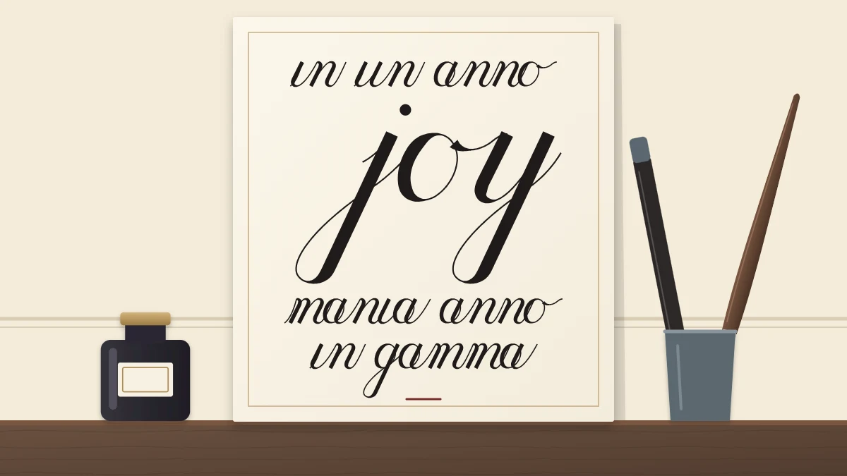
This walk-through uses a saying composed for the purpose, “leave room for joy in every ordinary day”, and follows it from loose words to an inked page. Swap in a line of your own and the steps stay the same.
Choose words you are free to use
The simplest choice is a sentence you wrote yourself: a wish for a friend, a family saying, a reminder for your own desk. Eight to twelve words is a comfortable length for a first piece.
Words written by someone else, such as passages from books, poems or songs, usually belong to their author or publisher. For anything you plan to give away, display or sell, use your own words or text you have the right to use. If you need a starting point, the practice phrases composed for this site show how plain a good line can be.
Pick the key word
Read the saying aloud and notice which word carries it. In the example, that word is “joy”. It will be written larger and heavier than the rest, and it becomes the first thing a viewer sees.
Choose one key word, or at most a pair. If three words are emphasized, none of them stands out. Short words make the best key words, because doubling their size does not make the line too wide.
Break the text into lines
Three or four lines suit a short saying. Give the key word a line to itself and break the rest where the sense pauses:
- leave room for
- joy
- in every
- ordinary day
Each line holds together as a small unit of meaning, and the lengths alternate between long and short. If a break leaves one small word stranded, move a word up or down until both lines read naturally.
Sketch thumbnails
Before measuring anything, draw four small rectangles in the proportions of your paper. In each, show the lines as bars: thin bars for the ordinary lines, a thick bar for the key word. Try the key word on the second line, in the middle, or at the end. Try the block higher or lower on the page.
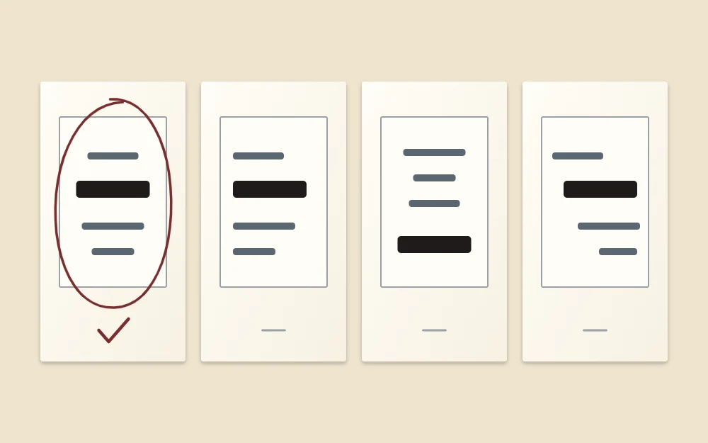
Circle the version you like best. For a first piece, a centered block is the most forgiving choice, since lines of different lengths look intentional around a center line.
Choose two sizes and one script
Keep the contrast simple. Use the script you already practice, at two sizes, and let size and weight do the work. Several different styles on one small sheet compete with each other and expose every weak letter.
A workable pairing is your normal practice size for the ordinary lines and double that for the key word. With a 6 mm (about 1/4 in) x-height for the small lines, the key word gets a 12 mm (about 1/2 in) x-height. Weight follows naturally: a larger letter can take fuller pressure on the downstrokes, or a large-tip brush pen if you have one.
With ascender and descender spaces equal to the x-height, a small line needs 18 mm of height and the large line needs 36 mm. Leaving a 6 mm gap between lines, the four lines stack up like this, measured down from the top of the block:
| Line | X-height | Baseline at |
|---|---|---|
| leave room for | 6 mm | 12 mm |
| joy | 12 mm | 48 mm |
| in every | 6 mm | 78 mm |
| ordinary day | 6 mm | 102 mm |
The last descender line falls at 108 mm, so the whole block is about 4 1/4 in tall. On a sheet 8 x 10 in (about 20 x 25 cm) that leaves room for wide margins, with a little more space below the block than above it.
Draft in pencil on the final paper
First write each line on scrap paper at its real size and measure its length. Then move to the good sheet.
- Rule the baselines and waistlines lightly, using the positions you worked out.
- Draw a faint vertical center line. On an 8 in wide sheet it sits 4 in from either edge.
- Mark where each line starts and ends. A line that measures 3.5 in begins 1.75 in to the left of the center line.
- Pencil in the words with a light touch, just dark enough to see.
The measuring and centering steps are explained in full in the guide to layout basics, margins and line breaks. Prop the penciled sheet upright, step back and check the shape before you go on. It is much easier to move a line now than later.
Tip
Press lightly with a sharp, fairly hard pencil. Heavy pencil lines dent the paper, catch a nib and never erase completely.
Ink from the top down
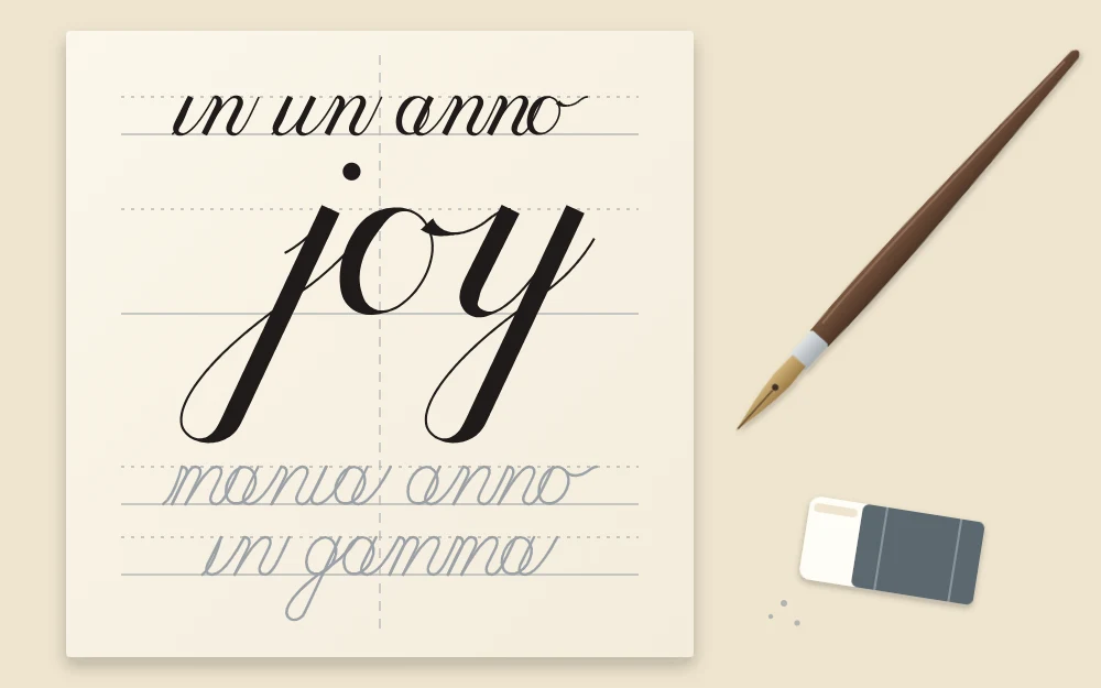
Warm up on scrap paper until your strokes feel steady, and write the key word once at full size so the larger scale is not a surprise. Then begin with the top line and work downward, so your hand never rests on wet ink. A clean sheet of scrap paper under your writing hand protects the area below from smudges.
Follow your pencil marks for position, but write the letters as you would in practice, one stroke at a time, instead of copying the pencil shapes slavishly.
Good to know
If you are using a dip pen, protect the desk and your clothing before you open the bottle, because ink can stain permanently. Keep the bottle capped when you are not dipping.
Erase only when the ink is fully dry
Thick downstrokes hold more ink than they appear to, and the large key word dries last. Leave the sheet flat and be generous with the waiting time; several hours or overnight is a cautious choice. Test by erasing over a stroke on your scrap sheet made with the same ink and paper.
If a letter went wrong, resist patching it. Keep the sheet as your record, rule another, and write the piece again; the second version is usually calmer. The same plan, scaled down to one or two words, also works for simple greetings on handmade cards.
Frequently asked questions
How many words should a first calligraphy piece have?
Somewhere between eight and twelve words is manageable. That gives three or four lines, enough to practice line breaks and centering without turning the project into a long writing session. Shorter is fine too; a saying of four or five words on two lines makes a good first attempt.
Can I use more than one script in a quote?
You can later, but it is harder than it looks. Each style needs to be equally well practiced, or the weaker one stands out. For early pieces, one script at two sizes gives plenty of contrast and keeps the whole page consistent in slant, weight and spacing.
How long should I wait before erasing the pencil lines?
Longer than you think. Drying depends on the ink, the paper and how thick the strokes are, so there is no single figure. Waiting several hours or overnight is cautious. Before touching the real piece, erase over a test stroke made with the same ink on the same paper.