Pen Angle in Calligraphy: What It Is and How to Keep It Steady
Why a broad-edge pen makes thick and thin lines without pressure, what pen angle means, two quick checks to confirm yours, and how to hold it steady through curves.
Practice at a glance
What you need
- Broad-edge pen or nib, around 3 mm wide
- Smooth practice paper
- Pencil and ruler
- Ink, if using a dip nib
Pick up a broad-edge pen for the first time and the line seems to have a mind of its own: wide in one direction, hair-thin in another, without any change in how hard you press. That is the tool working as intended.
Pen angle in calligraphy is the idea that explains it. Once you understand what the angle is and can hold it steady, the thick and thin parts of every letter land in the same places, and your writing begins to look like one consistent hand.
Why a broad-edge nib makes thick and thin
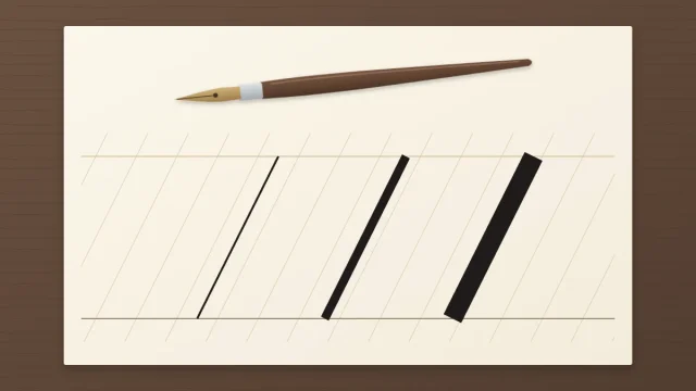
A broad-edge nib ends in a flat, straight edge, like a tiny chisel. Pressure plays almost no part in the width of its line. What matters is the direction the pen travels compared with that flat edge.
- Move the pen sideways along the edge, and only the thin end of the nib leads. The result is a hairline.
- Move the pen at a right angle to the edge, and the full width of the nib sweeps the paper. The result is the thickest stroke that nib can make.
- Move in any direction in between, and the width falls somewhere between the two.
This is the opposite of a pointed nib or brush pen, where you create contrast by pressing and releasing. If you are unsure which family your pen belongs to, the overview of the main types of calligraphy sorts them out.
What pen angle means
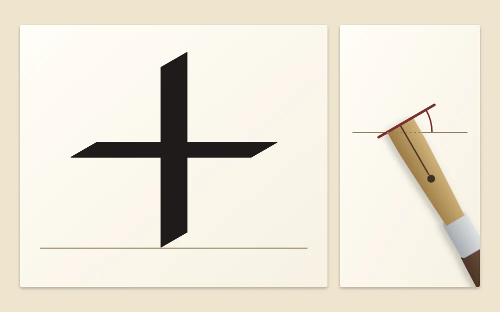
Pen angle is the angle between the nib’s flat edge and the baseline. With the edge lying parallel to the baseline, the pen angle is zero. Turn the nib so the edge points up to the right, and the angle grows.
Because the edge sets which directions are thick and which are thin, the pen angle decides where the weight falls in a letter. Hold it constant and every vertical stem has the same width, every horizontal bar matches, and the curves swell and thin in the same spots.
Common reference angles
Two figures come up again and again. Treat them as conventions that many scripts use, and as places to start, not laws.
| Pen angle | Often used for | Effect |
|---|---|---|
| Roughly 30 degrees | Many upright hands, such as a foundational-style hand | Vertical strokes clearly thicker than horizontal ones |
| Around 45 degrees | Italic styles | Vertical and horizontal strokes about equal; a thin diagonal up to the right |
Two quick checks: the plus sign and the zigzag
The plus sign
Set the nib at your chosen angle and draw a vertical stroke downward, then a horizontal stroke across it, without turning the pen.
- At about 30 degrees, the vertical bar is noticeably thicker than the horizontal bar.
- At about 45 degrees, the two bars are the same width.
- If the horizontal bar is the thicker one, the angle has gone steeper than 45 degrees.
The zigzag
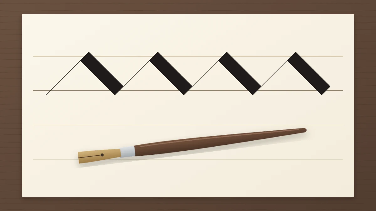
Holding the same angle, push the pen up to the right along its edge, then pull it down to the right, and repeat across the line. At 45 degrees the upward diagonals are as thin as the nib can go and the downward diagonals are as thick as it can go. If the thin strokes start to fatten partway along the row, the nib has turned in your fingers.
Keeping the angle fixed while your hand moves
The hard part is holding the angle through curves. When you write an o, your hand travels in a circle, and the instinct is to turn the pen with it, as you would with a pencil. With a broad edge, the nib keeps pointing the same way while the hand moves around.
A few things that help:
- Set the angle before each stroke. Touch the nib down, glance at the edge, then move.
- Keep the whole edge on the paper. If one corner lifts, the stroke goes ragged on one side. Even contact matters more than pressure.
- Move from the arm for longer strokes. Fingers that curl to reach tend to rotate the pen.
- Leave the barrel alone. Rolling the pen between finger and thumb is the usual way the angle slips.
- Rule a few faint reference lines at your chosen angle across the top of the page and compare your nib edge with them from time to time.
How you grip the pen affects all of this, and there is more than one workable way. Left-handed writers in particular often turn the paper or use a nib cut at a slant to reach the same angle. The guide on holding a calligraphy pen sets out the options; keep your hand relaxed and adjust for comfort.
Nib-width ladders: setting letter height
Broad-edge letter height is not measured in fixed units. It is counted in nib widths, so letters keep the same proportions whatever size of pen you use.
- Rule a baseline in pencil.
- Turn the nib so its edge is at a right angle to the baseline and make a short sideways stroke, forming a small square as tall as the nib is wide.
- Make the next square just above and beside the first, corner touching corner, like a staircase.
- Stack as many as your hand calls for. Many hands use about 4 to 5 nib widths for the x-height.
- Rule the waistline through the top of the ladder.
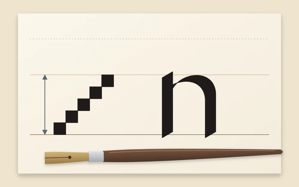
Fewer nib widths give heavier, darker letters; more give a slimmer, more open look. For ruling the remaining lines, see how to draw calligraphy guidelines.
Three angles that are easy to confuse
- Pen angle: the nib edge compared with the baseline. It controls where thick and thin fall.
- Letter slant: how far the letters lean from upright. Italic styles lean forward a few degrees; many other broad-edge hands stand straight. You can change the slant without changing the pen angle.
- The pen’s angle to the paper: how steeply the barrel rises from the page. This affects ink flow and how the edge sits, and it is a matter of comfort and tool. It has nothing to do with the 30 or 45 degree figures.
When an instruction gives an angle for a broad-edge hand, it almost always means the first of these. Check the plus sign, hold the edge steady, and let the direction of each stroke do the rest.
Frequently asked questions
Does pen angle matter with a pointed nib or brush pen?
Not in the same sense. Pointed nibs and brush pens create thick and thin through pressure, so the term pen angle is normally reserved for broad-edge tools. With pressure-based pens you think about letter slant and how the pen sits in your hand instead.
Do I need a protractor to set the pen angle?
No. A plus sign is a quicker check: if the vertical bar is clearly thicker than the horizontal one you are near 30 degrees, and if they match you are near 45. You can also rule a few faint slanted reference lines in pencil and compare your nib edge with them.
Why are my broad-edge strokes ragged on one side?
Usually one corner of the nib is lifting, so only part of the edge is touching the paper. Lower the barrel or roll the pen very slightly until both corners make contact, then keep the pressure even and light. A dry nib or textured paper can cause similar rough edges.