Calligraphy Slant: How to Keep Your Letters Leaning the Same Way
Slant is the lean of your downstrokes from the baseline. Learn how to choose one, rule slant lines, rotate the paper, and check that stems, ovals and loops all lean the same way.
A word can have well-formed letters and still look unsteady if those letters lean in different directions. One stem tips forward, the next stands up, an oval falls backward, and the eye reads the result as nervous. Calligraphy slant is the name for that lean, and keeping it consistent is one of the quickest ways to make writing look calm.
The good news is that slant is easier to fix than most problems, because you can rule it, measure it and check it with simple tools.
What slant means
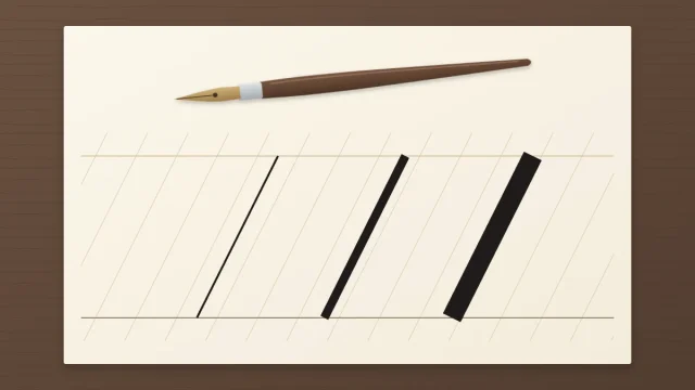
Slant is the lean of your downstrokes, measured as the angle between the stroke and the baseline. A stroke standing straight up is at 90 degrees. The smaller the number, the further the stroke leans to the right.
Slant is not the same thing as pen angle, a term that belongs to broad-edge calligraphy and describes how the flat edge of the nib is turned. Slant describes the letters; it applies to every kind of script.
Which slant should you use?
Many traditional pointed-pen scripts, such as copperplate-style hands, lean at roughly 55 degrees from the baseline. That is a convention of those scripts, not a rule for all calligraphy. Italic styles usually lean only a few degrees, and modern brush and pointed-pen styles are often more upright, with many written at or near vertical.
| Slant from the baseline | Where you often see it | How it reads |
|---|---|---|
| Roughly 55 degrees | Many traditional pointed-pen scripts | Formal, flowing |
| Around 65 to 80 degrees | Many modern and italic styles | Relaxed, easy to read |
| 90 degrees | Upright modern styles and many broad-edge hands | Steady, plain |
These ranges are loose descriptions, not categories. Any slant works if it is consistent. A steep lean is harder to hold at first, so a more upright angle is a reasonable place to begin, and you can change it later. What looks wrong is mixing angles within one piece.
Rule slant lines under your writing
The most direct aid is a set of parallel diagonal lines to follow. Rule them in pencil across your horizontal lines with a ruler and a protractor, spaced roughly 10 to 15 mm (about 1/2 in) apart, or rule them in dark pen on a separate sheet and slide it under thin layout paper so the lines show through.
The lines are a reference for direction, not boxes to fill. Your downstrokes do not have to sit on them; they only have to run parallel to the nearest one. The full method, including the horizontal lines, is in the guide to ruling calligraphy guidelines.
Rotate the paper
Most hands find it easiest to pull a stroke straight toward the body. You can use that. Instead of bending your wrist to make slanted strokes on a square page, turn the page until the slant lines point roughly at your chest or your writing-side shoulder. Then every downstroke is the same simple pull.
For a steep slant, right-handed writers often end up with the paper turned well counterclockwise. Left-handed writers commonly turn it clockwise instead, sometimes a long way, and some write with the page almost sideways. These are starting points. Turn the sheet a little at a time until pulled strokes fall along the slant lines without effort, and adjust for comfort.
Tip
As you work across a line, slide the paper to the left every few words instead of reaching further with your arm. Your hand stays in the same spot relative to your body, and the slant stays the same from the start of the line to the end.
Three quick ways to check your slant
- Turn the sheet upside down. You stop reading the words and see only shapes. A stroke leaning the wrong way stands out immediately.
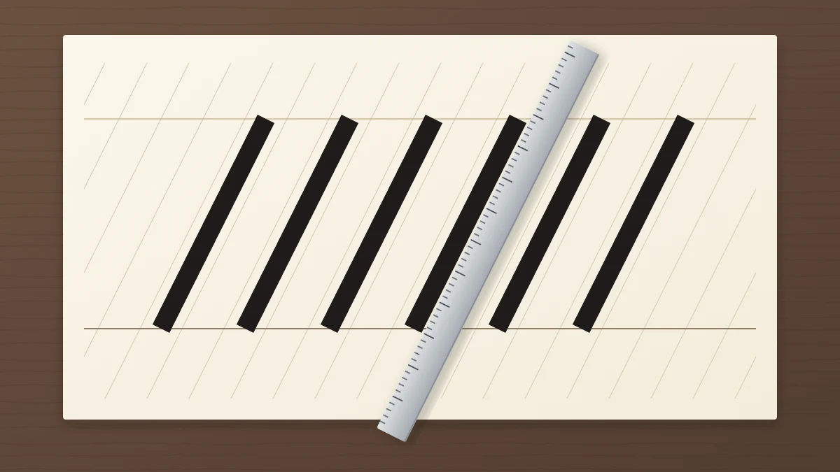
- Lay a ruler along the stems. Line the edge up with one downstroke, then slide it along the row without rotating it. Each stem should stay parallel to the edge.
- Extend the stems in pencil. Draw light lines up through several downstrokes. Parallel lines mean a steady slant; lines that cross or fan apart show where it drifted.
Looking along the line from a low angle at the side of the desk works too. Checking after each row, not after each page, lets you correct the next row while the feel is fresh.
Ovals and loops follow the same lean
Straight stems are the easy part. Curved shapes have no straight edge to compare, so they are where slant usually slips. A slanted row with upright ovals in it looks as uneven as a row with crooked stems.
Imagine a line through each oval from its top to its bottom; that line should be parallel to the slant lines. The same is true of a loop: the thick stem runs along the slant, and the hairline loop leans with it without bulging off to one side.
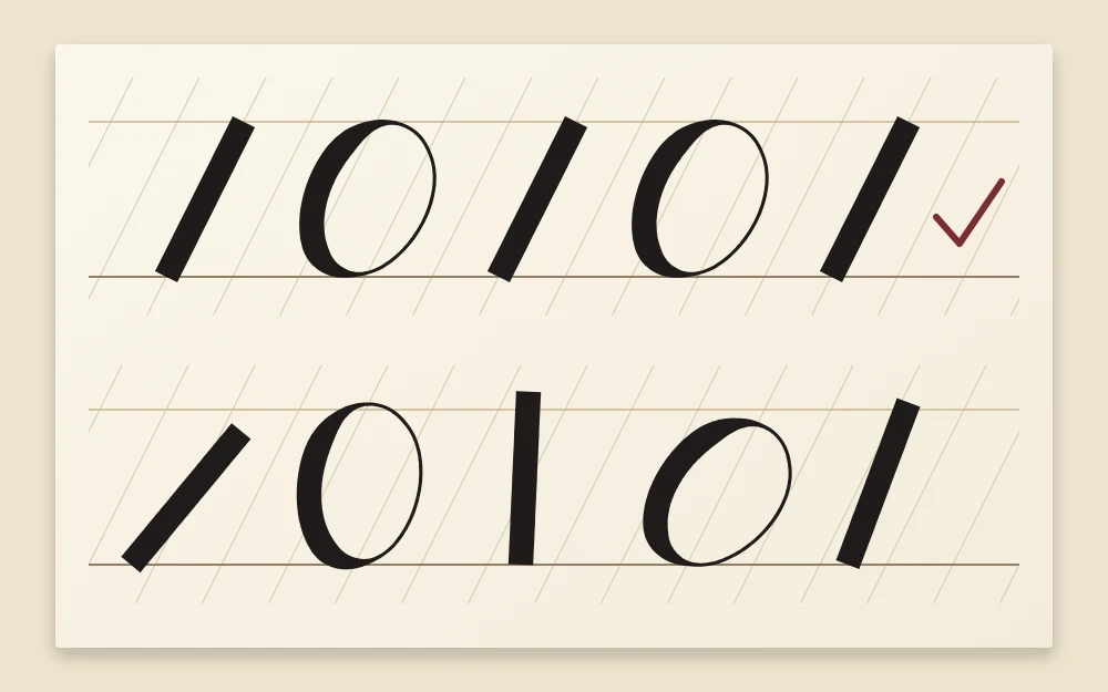
If round letters are the ones that wander, the drills in the guide to the oval stroke are aimed at exactly that.
Why slant drifts, and what to do
- It gets steeper along the line. Your hand has traveled away from your body while the paper stayed still. Move the paper, not the arm.
- Tall letters lean differently from short ones. Long strokes made with the fingers alone tend to curve. Let the whole hand slide for ascenders and descenders.
- It changes from line to line. The page probably rotated as you moved down it. Re-check the paper angle at the start of each line.
- It changes as you speed up. A faster hand falls back into its handwriting slant. Slow down, or choose a slant closer to your natural one.
- Only certain letters are off. Write a row of that letter alone between slant lines, alternating it with a plain downstroke for comparison.
If holding a slant makes your wrist or shoulder uncomfortable, stop and change the paper position or try a more upright angle.
Slant and spacing work together
When every stem is parallel, the white spaces between them become regular stripes, and the eye can judge whether they are even. When the slant varies, the gaps become wedges, wide at one end and narrow at the other, and no amount of adjusting will make them look equal.
That is why it pays to settle slant first. Once it holds, the next step is the gaps themselves, covered in the guide to calligraphy letter spacing.
Frequently asked questions
Do I have to write at a 55 degree slant?
No. Roughly 55 degrees is a convention in many traditional pointed-pen scripts, and it suits their long flowing shapes. Modern styles are often more upright, and plenty of calligraphy is written vertically. Choose a lean that feels comfortable, then concentrate on keeping it the same throughout a piece.
Does an oblique pen holder fix my slant?
It can help, but it does not do the job alone. An oblique holder sets a pointed nib at an angle so that right-handed writers can reach a steep slant more comfortably. You still need slant lines and a suitable paper position to keep strokes parallel.
Can calligraphy slant to the left?
Yes. A backward slant is less common in traditional scripts, but it is a legitimate choice in modern styles, and some left-handed writers find it natural. The same principle applies: every downstroke, oval and loop should share the one lean.