Calligraphy Letter Spacing: How to Space Letters Evenly
Even spacing comes from balancing the white space between downstrokes, not from measuring gaps. Learn the n-counter guide, how hairlines set spacing, and three quick checks.
Each letter looks fine on its own, yet the finished word has a tight knot in one place and a hole in another. That is a spacing problem, and it is one of the most common reasons a beginner’s page looks uneven even when the letterforms are sound.
Good calligraphy letter spacing is not measured with a ruler. It is judged by eye, and what the eye reads is the pattern of white shapes between the thick strokes. Once you know where to look, most spacing faults become easy to spot and fairly quick to fix.
Spacing is the white space between downstrokes
A word in script is a row of thick downstrokes tied together by hairlines. The hairlines are so light that the eye mostly ignores them and sees the dark stems, like the posts of a fence. When the posts stand at even intervals, the word looks calm. When two posts crowd together or one stands apart, the eye catches it at once.
This is why measuring the gap between letters does not work. Letters have different outlines: an o bulges, an l is straight, an r leaves an open pocket on its right. Equal distances between their edges would give unequal amounts of white. What you balance is the area of white, not the distance.
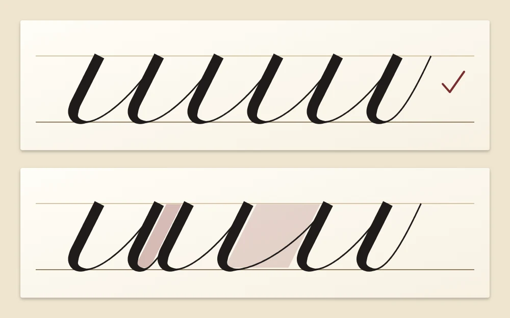
Use the inside of n as your measure
The handiest reference is already on your page. The white space inside an n, between its two downstrokes, is called the counter. The space inside a u is the same shape turned over.
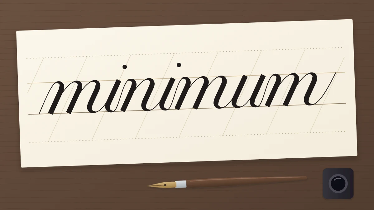
Aim for the white between two letters to look about equal to the white inside an n or u. Write “nun” or “minimum” and every downstroke should seem to stand the same distance from the next, whether the space falls inside a letter or between two letters.
If your n is narrow, your spacing will be tight, and if your n is wide, your spacing will be open. Either can look good. The goal is agreement between the letters and the spaces, not a particular width.
How the connecting hairline sets the gap
In a joined script you do not choose a space and then fill it. The exit stroke of each letter carries the pen to the start of the next one, so the hairline itself decides the gap. Two features of that stroke matter.
- Length. A hairline that travels farther to the right before reaching the waistline opens the space. One that stops early closes it.
- Angle. A steep hairline climbs quickly and keeps letters close. A flat hairline drifts sideways and pushes them apart.
When one gap in a word looks wrong, look at the hairline that leads into it. Usually it is steeper or flatter than its neighbors. The mechanics of that stroke are covered in the guide to connecting letters; for spacing, the point is simply to keep every low join at a similar length and angle.
Slant plays a part as well. If one stem leans more than the next, the white between them becomes a wedge, wide at one end and pinched at the other, and no hairline can repair it. If that keeps happening, spend some time on keeping a consistent slant before you worry about the gaps.
Round letters next to straight ones
Different outlines need slightly different treatment so that the white areas stay equal.
| Combination | Example | Adjustment |
|---|---|---|
| Straight next to straight | il, ni, ut | Your standard gap; the widest of the three |
| Straight next to round | no, id, al | A little closer than standard |
| Round next to round | oo, oc, ce | Closest of all, curves nearly touching |
The reason is the corners. Two straight stems make a rectangle of white. A curve bends away from its neighbor at the top and bottom, leaving extra white in the corners, so the letters have to sit closer to compensate.
Open letters behave like round ones. The letters r, c, e, s and t bring their own pocket of white on the right side, so the following letter can tuck in a little. In a word such as “rare”, starting each letter slightly sooner than feels natural usually evens it out.
Tip
Before inking a word, write it lightly in pencil at the same size. Trouble spots show up in the pencil version, and you can plan a shorter or longer hairline where it is needed.
Spacing between words
Word spaces follow the same logic on a larger scale. A common guide is to leave about the width of one letter, such as an o, between words. That is enough for the eye to register a break, and small enough that the line still holds together.
Beginners tend to leave much more than this, which breaks a line into separate islands. If your words seem to float apart, imagine an o sitting in the gap and start the next word just beyond it. Keep the word spaces consistent along a line, in the same way you keep the letter spaces consistent within a word.
Three quick checks for even spacing
Your eye gets used to a word as you write it, so step back and look at it in a way that hides the meaning.
- Squint. Narrow your eyes until the letters blur into gray. An even word becomes an even gray band. A cramped spot appears as a dark patch and a gap as a pale hole.
- Turn the page upside down. You stop reading and start seeing shapes. Uneven white spaces stand out clearly when the letters are unfamiliar.
- Follow the thick strokes. Run your eye along the downstrokes only and notice their rhythm. It should feel like a steady beat, without a rush or a pause.
Mark each fault with a small pencil dot under the line, then write the word again and correct only those spots.
Practice words that train spacing
Start with words made of straight strokes, where the rhythm is easiest to see, and add curves afterward.
- Straight strokes only: minimum, nun, mint, unit.
- Straight and round mixed: noon, done, mood, hand.
- Open letters: rare, tree, secret, street.
Write each word three times, run the three checks, and note which combinations gave you trouble. When single words look even, the structured sets in the guide to practicing whole words give you more material to work on.
Frequently asked questions
How much space should there be between calligraphy letters?
There is no fixed measurement. A practical guide is to make the white space between two letters look about equal to the white space inside your own letter n. Because that depends on how wide you write, the right amount is whatever keeps the downstrokes evenly distributed.
How much space goes between words in calligraphy?
A common guide is roughly the width of one lowercase letter, such as an o. That is enough to separate the words clearly without breaking the line into pieces. Whatever width you choose, keep it consistent from one word space to the next.
Why does my spacing look uneven even when I measure it?
Letters have different outlines, so equal distances between their edges leave unequal areas of white. Round and open letters carry extra white in their corners and need to sit closer together than two straight stems. Judging the white shapes by eye works better than measuring.