Uppercase Calligraphy Letters: Fundamentals for Beginners
Capitals are larger, rarer and built from only a few new strokes. Learn the four building strokes, three shape groups, and how to match capitals to your lowercase.
Practice at a glance
What you need
- Smooth practice paper
- Pencil and ruler
- Small-tip brush pen or pointed nib in a holder
- Ink, if using a dip pen
Capitals have a reputation for being difficult, mostly because finished pieces show them covered in loops and swirls. Underneath the decoration, uppercase calligraphy letters are plain shapes made from a handful of strokes, and you already control most of the movements from your lowercase practice.
It also helps to remember how rarely capitals appear. In an ordinary line of writing, a capital opens a sentence or a name and then steps aside for a long run of small letters. A simple, steady capital that matches the rest of the word does its job well.
What makes capitals different
Three things change when you move from lowercase to uppercase:
- Size. Capitals are about twice the height of a lowercase n or more, so every stroke travels farther and small wobbles show.
- Frequency. You write far fewer of them, which means they get less accidental practice.
- Strokes. A few building strokes are new, although each one is a larger relative of a stroke you know.
If your lowercase letters still feel unsettled, give them more time first. Capitals borrow their weight, slant and rhythm from the small letters, so a steady lowercase makes the capitals much easier to judge.
The four building strokes for capitals
Practice these on their own before writing any letters, filling a line with each one.
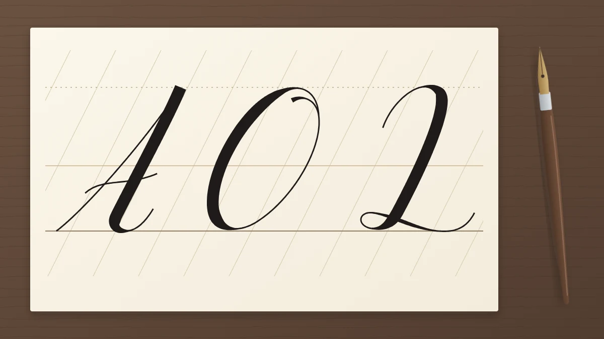
- The tall stem. A long thick downstroke from the top line to the baseline with a very slight curve, like a relaxed version of the lowercase downstroke. Add pressure gradually at the top and release it gradually at the bottom so both ends taper.
- The large oval. The lowercase oval at double size, leaning on the slant line, thick on the left side and thin on the right.
- The entry loop or hook. A hairline that begins to the left of the letter, swings up and over in a wide curve, and leads into the stem.
- The horizontal hairline. A thin, light stroke used for crossbars and tops, often with a gentle wave instead of a ruler-straight line.
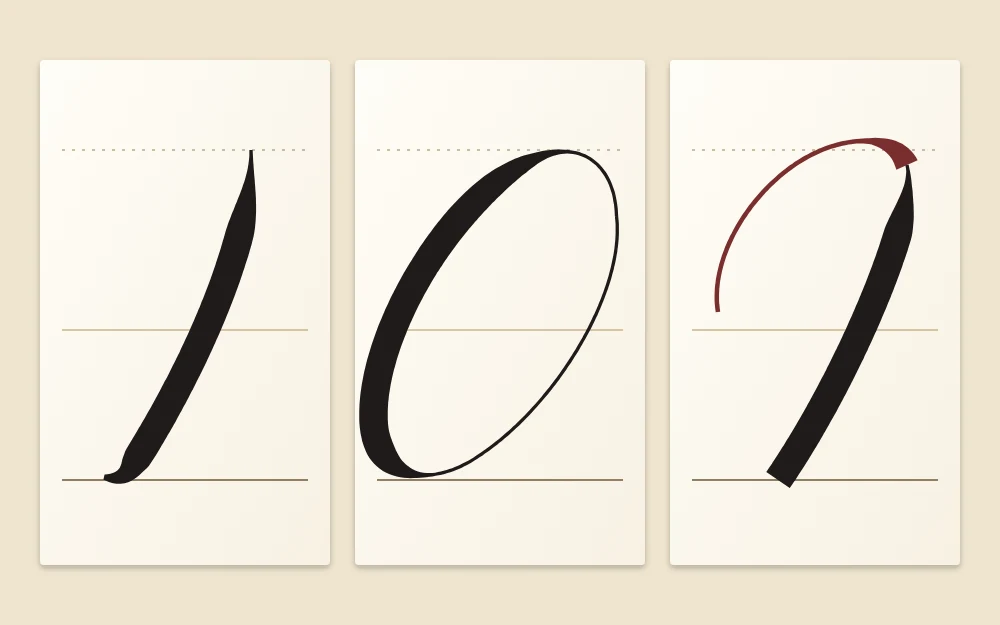
The tall stem deserves the most repetition. Because it is long, speed makes it shake; a slow, even pull with the whole arm moving, not only the fingers, usually gives a smoother line. Adjust how you hold the pen until that movement feels comfortable.
Learn capitals in shape groups
As with lowercase, families are kinder than alphabetical order. Sorting the capitals by their main stroke gives three groups.
Stem letters
These start from the tall stem, often with an entry loop or a hairline top: L, T, F, P, B, R, D, H and K. Begin with L and T, which are a stem plus one extra stroke, then add the letters with bowls, such as P, B and R. In H and K, two stems must lean at the same angle, which is a useful test of control.
Oval letters
O, C, G, Q and E come from the large oval. O is the oval alone, closed neatly at the top. C is an open oval, G adds a short stem or loop at the lower right, and Q adds a small tail. E can be written as two smaller open curves stacked on the slant.
Compound letters
The remaining capitals combine stems with hairline diagonals or curves: A, M, N, V, W, U, Y, X, Z, S and J. A, M and N alternate thin upstrokes and thick downstrokes, exactly as the lowercase arches do. V and W are their mirror images. S and J rely on one long curved stem that changes direction, so leave them until last.
Keep capitals simple before you add flourishes
A flourish is an extension of a stroke that already exists. If the stroke underneath is shaky, the flourish magnifies the problem. Write each capital in its plainest form until you can repeat it at a consistent size and slant, and only then let an entry loop grow a little wider or a crossbar a little longer.
Tip
Add one extra curve at most to any capital while you are learning. A single generous entry loop looks more confident than three small decorations competing for space.
Match the weight and slant of your lowercase
A capital should look as if it was written with the same pen, on the same day, as the letters that follow it. Two things carry that match:
- Weight. The thick part of a capital stem should be about as wide as your lowercase downstrokes. It is tempting to press harder because the letter is bigger; resist it, or the capital looks heavy and separate.
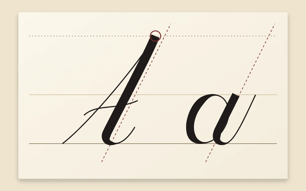
- Slant. Stems and oval axes follow the same slant lines as the small letters. A capital that stands more upright than its word is noticeable immediately.
Set capital height against the ascender line
Many scripts take capitals to the ascender line, the same height as the top of an l or h, and some stop slightly below it. Either convention works as long as you keep to one choice across the page. If your sheet has no ascender line yet, the guide to ruling guidelines explains how to add one.
The base of nearly every capital rests on the baseline. Only a few tails, such as those on J, Q and Y in some styles, drop below it.
Practice in capital and lowercase pairs
Writing a line of isolated capitals tells you little about how they behave in real words. Pairing each one with a small letter trains size, slant and spacing together.
- Write the capital, then its own lowercase beside it: Aa, Bb, Cc.
- Check that the capital reaches your chosen top line and that both letters lean the same way.
- Next, pair the capital with a vowel that might follow it in a word: La, Mo, Te.
- Leave the space between the two letters close to your normal letter spacing, even if the capital does not join.
Not every capital needs to connect to the next letter. Where an exit stroke would look forced, simply lift and begin the lowercase letter close by.
Short first names are the natural next exercise because each one starts with a capital and gives it a job to do. Try Anna, Leo or Mia, and see the guide to writing names in calligraphy for spacing and layout ideas.
Frequently asked questions
Should I learn uppercase or lowercase calligraphy letters first?
Lowercase usually comes first. Small letters make up most of any line of writing and they set the weight, slant and rhythm that capitals have to match. Once your lowercase is reasonably steady, capitals become easier to judge because you have something to compare them with.
How tall should capital letters be in calligraphy?
A common convention is to take capitals up to the ascender line, the same height as letters such as l and h, or to stop slightly below it. Either works. What matters is choosing one height and keeping it consistent across the whole page.
Do capital letters have to connect to the next letter?
No. Some capitals end with a stroke that leads naturally into the next letter, and many do not. When a join would look forced, lift the pen and start the lowercase letter close to the capital so the spacing still reads as one word.