How to Write Names in Calligraphy: Capitals, Spacing and Flow
A step-by-step way to write a name well: draft it in pencil, decide how the capital meets the lowercase letters, keep the spacing even and center it on a tag or card.
Practice at a glance
What you need
- Smooth practice paper
- Pencil and ruler
- Soft eraser
- Small-tip brush pen or pointed nib with holder and ink
- Blank tags or small cards
A name is the shortest finished piece you can make: one capital, a handful of lowercase letters, and nowhere to hide a wobble. That is also what makes it such useful practice. Learning how to write names in calligraphy trains the join between a capital and a lowercase word, even spacing, and the habit of placing a single word neatly on a small surface.
The method here suits a gift tag, a label, an envelope or a card. It starts with a pencil draft, so the ink version follows a plan instead of a hope that the name will fit.
What a name asks of you
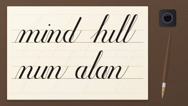
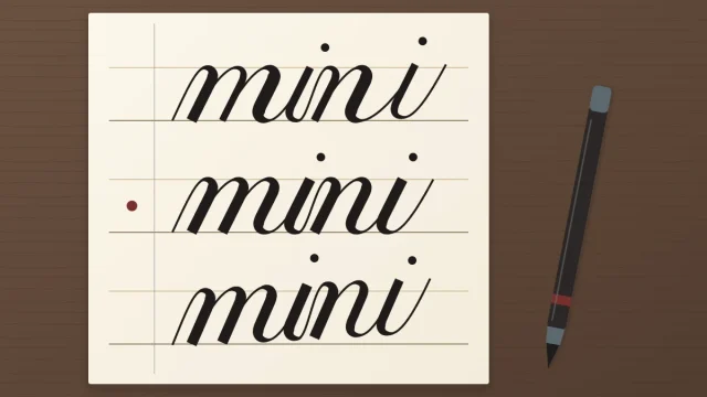
A name is a capital followed by a lowercase word. If you can already write short words, most of the name is familiar ground. If not, spend some time on your first words, letter by letter before you go further.
The new part is the first letter. Capitals are taller and wider than lowercase letters and they turn up far less often, so they get less practice. It helps to have a plain set of uppercase letters that you can write without stopping to think.
Start with a pencil draft
The draft tells you how long the name really is at your writing size. Guessing is what pushes the last letters against the edge.
- Rule guidelines on scrap paper at the x-height you normally practice with.
- Write the name in pencil at full size, in the same script and at your usual pace. Do not squeeze or stretch it.
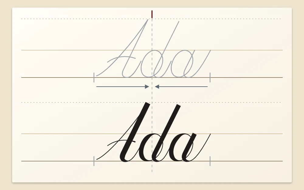
- Measure the draft from the leftmost point of the capital to the end of the last exit stroke.
- Compare that length with the space you have. A tag 3.5 in (8.9 cm) wide and a name 2 in (5.1 cm) long leave 1.5 in spare, which is 0.75 in (1.9 cm) on each side.
- If the name is too long, lower the x-height a little and draft again. Narrowing only some of the letters makes the word look pinched.
Decide how the capital joins
You have two choices, and both are fine. The capital can connect to the second letter, or it can stand apart with a small gap.
Connecting capitals
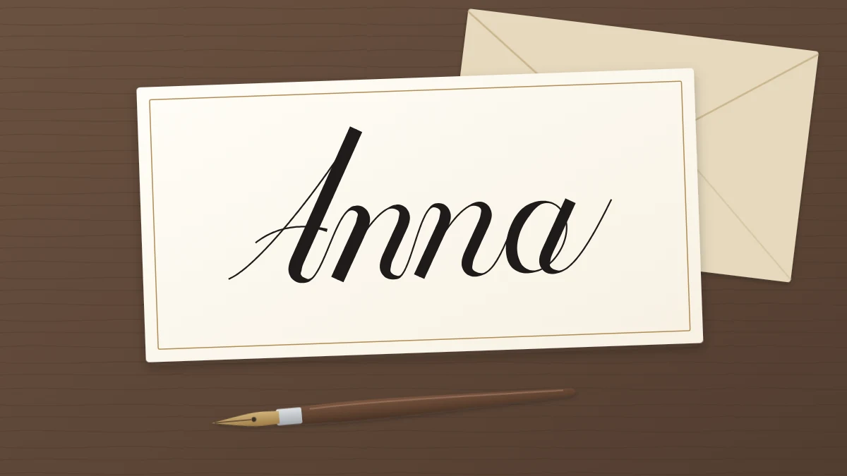
Capitals that finish at the baseline on their right side tend to connect easily. In Anna, the last stroke of the A can leave the baseline as a thin exit stroke and rise to become the entrance of the n. Capitals such as K, L, M and R often behave the same way.
Capitals that stand apart
Round, closed capitals and capitals that finish at the top usually look calmer on their own. In Owen or Tom, forcing a hairline from the capital into the next letter tends to produce an awkward hook. Lift the pen and begin the lowercase letter with a short entrance stroke of its own.
When the capital stands apart, keep the second letter close. A gap about as wide as the white space inside your lowercase n is a common guide. A wider gap makes the capital drift away, and the name reads as an initial followed by a separate word.
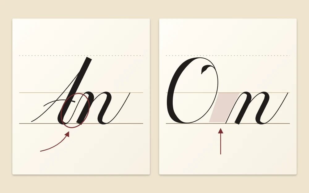
Either way, give the capital the same slant and the same downstroke weight as the lowercase letters. A capital that leans differently looks borrowed from another hand.
Watch ascenders and descenders
Tall letters and tails change the outline of a name. Ascenders in b, d, h, k and l rise to the ascender line and can compete with the capital. Keep the capital at the same height as the ascenders or slightly taller, and make the same choice every time.
Descenders in g, j, p and y need room below the baseline. On a small tag, check that the tail of the y in Lucy does not run into a border or off the edge. The pencil draft shows this before any ink is involved.
When a name has a descender and no ascender after the capital, such as Mary, move the baseline slightly higher on the card. The word, tail included, then looks centered from top to bottom.
Keep the spacing even
Judge spacing by the white space between downstrokes, not by gaps between letters. In a short name every space is on show, so one cramped pair is easy to spot.
- Double letters: treat them as twins. The two n shapes in Anna should have the same width and the same arch, giving four evenly spaced downstrokes.
- Double stems: in Ella or Emmett, keep the tall stems parallel and the same height.
- High exits: after o, v and w the connecting hairline leaves from the waistline. Keep it short so the next letter does not float away.
Center the name from the draft
Halve the measured length of the draft and mark that midpoint with a small pencil tick above the name. Then make a light tick at the center of the card. On the 3.5 in tag, that tick sits 1.75 in from either edge.
Hold the draft just above the writing area with the two ticks lined up, and make faint marks on the card where the name begins and ends. Write between those marks. If you are preparing many names for a table, the same method scales up to a batch of place cards.
Long names and two-part names
A long name such as Alexander or Elizabeth needs a smaller size, not tighter letters. Length scales with x-height: a name that measures 3 in at a 6 mm (about 1/4 in) x-height comes out at roughly 2.5 in at 5 mm (about 3/16 in).
For two-part names such as Mary Ann, leave a word space about the width of a lowercase o and write both capitals at the same size. On a narrow tag, two short lines sharing one center line can look better than one crowded line. A hyphen is a short hairline at about half the x-height.
Ink the final version
Warm up with a few strokes and write the capital once on scrap. Then ink the name slowly, lifting the pen between strokes as you do in practice. Let the ink dry fully before you erase any pencil. Drying times vary with ink and paper, so test a spare stroke on an offcut first, and cut an extra tag or two in case one goes wrong.
Frequently asked questions
Should the capital letter always connect to the rest of the name?
No. Some capitals end at the baseline on the right and flow into the next letter easily, while round capitals and those that finish at the top often look better standing apart. Try both on scrap paper and keep whichever looks calmer, as long as the gap stays small.
How do I make a long name fit on a small tag?
Draft the name in pencil at your usual size and measure it. If it is too long for the space, rule guidelines with a slightly smaller x-height and draft it again. Shrinking the whole name keeps its proportions, while squeezing a few letters makes the spacing uneven.
Why does my centered name still look off to one side?
A big capital on the left and a thin exit stroke on the right carry different visual weight, so a mathematically centered name can look shifted. Measure to the last thick downstroke instead of the tip of the final hairline, then nudge the starting mark and compare the two versions.