Calligraphy vs Hand Lettering: What Is the Difference?
Calligraphy is written and hand lettering is drawn. See how that one difference changes the tools, the process and what you practice, so you can tell which craft you want to learn.
Search for either term and you will see the same kinds of pictures: flowing script on cards, bold words on posters, names on envelopes. The two labels are used so loosely that it is hard to tell which one describes the thing you want to learn.
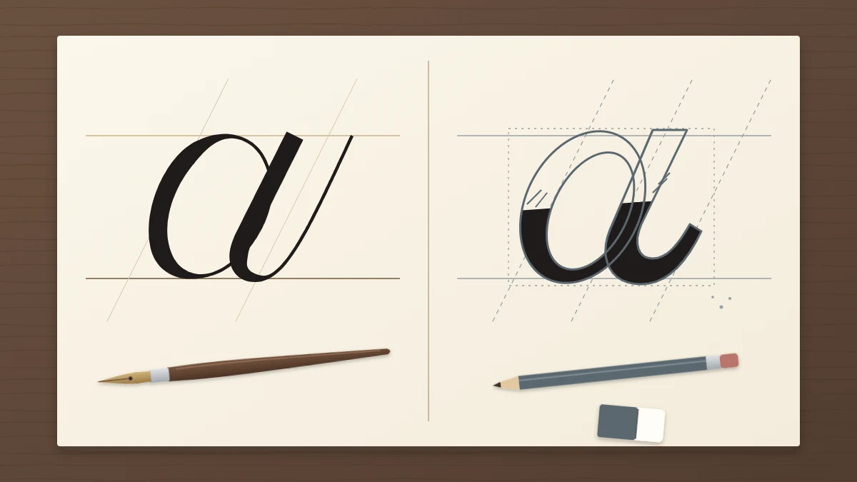
The question of calligraphy vs hand lettering has a short answer. Calligraphy is written. Hand lettering is drawn. Everything else, from the tools on the desk to what a practice session looks like, follows from that one difference.
The short answer: writing versus drawing
Calligraphy is writing. Each stroke is made once, and the pen or brush produces thick and thin lines on its own. With a flexible pointed nib or a brush tip, more pressure gives a thick downstroke and less pressure gives a thin upstroke. With a flat broad-edge nib, the angle of the edge does the same job. Nothing is outlined, and nothing is filled in afterward.
Hand lettering is drawing. Each letter is treated as a small illustration. The shape is sketched, usually in pencil, then adjusted, erased, redrawn, outlined and filled in. The thick parts are thick because someone drew them that way, not because a tool widened on the way down.
A useful test is to ask how the thick lines got there. If they came from a single pass of the tool, the letter was written. If they were built up, it was drawn.
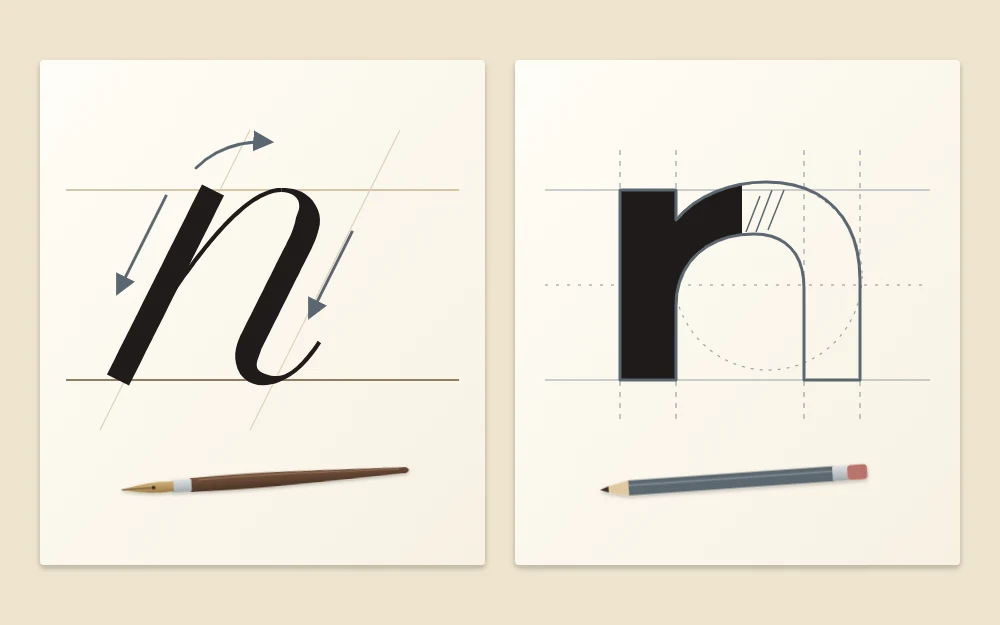
How the tools differ
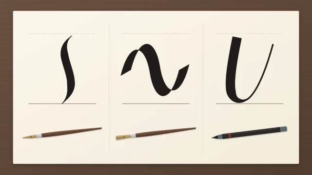
Because the tool creates the contrast in calligraphy, the tool matters a great deal. A pointed nib in a holder, a broad-edge pen and a brush pen each leave a recognizable mark, and each is tied to certain families of script.
Hand lettering is much less dependent on any one instrument. A pencil, an eraser and a fine drawing pen are enough, and almost anything that makes a mark can be used to fill a shape. The work is in the planning, not in how the tip behaves.
How the process differs
A calligrapher rules guidelines, loads the pen and writes. The strokes go down in a set order, and what lands on the paper is the result. If a letter goes wrong, it cannot really be repaired. You write it again.
A letterer works in layers. A rough sketch sets the overall arrangement, a tighter drawing refines each letter, and a final version is inked or filled. Correction is part of the method, so the eraser gets as much use as the pencil.
This also explains the difference in speed. A written word takes seconds once your hand knows the strokes, though getting to that point takes a lot of repetition. A drawn word can take much longer for a single piece, but it can be revised until it looks right.
What you actually practice
The two crafts train different things, which is the most practical reason to know which one you are after.
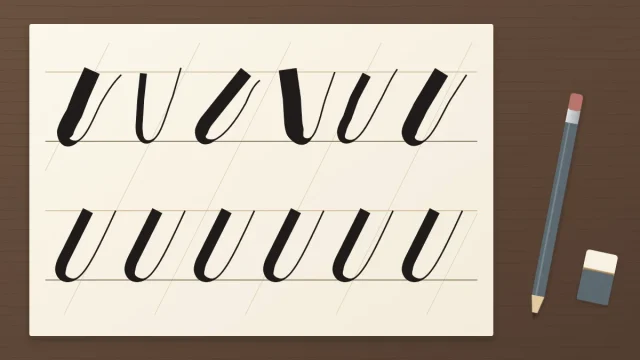
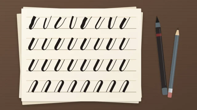
In calligraphy you practice movement. Sessions are filled with rows of repeated strokes, because script letters are assembled from a small set of shapes. You work on steady pressure, consistent slant, even height and rhythm, meaning the regular beat of thick and thin across a line. The guide to the basic strokes behind every letter shows where that practice begins.
In hand lettering you practice construction and composition. You study how a letter is proportioned, how its weight is distributed, how a group of words fits inside a shape, and how different styles sit together in one design. It is closer to illustration and layout than to penmanship.
Side by side
| Aspect | Calligraphy | Hand lettering |
|---|---|---|
| Core action | Writing | Drawing |
| Thick and thin | Made by the tool in one pass | Outlined and filled in |
| Typical tools | Pointed nib, broad-edge pen, brush pen | Pencil, eraser, fine drawing pens |
| Correcting | Write the letter again | Erase and redraw |
| Pace | Quick once the strokes are learned | Slower per piece, built in stages |
| Main practice | Strokes, pressure, slant, rhythm | Letter construction, composition |
Where the two overlap
The boundary is real, but it is not a wall, and two terms in particular cause confusion.
Brush lettering
This phrase usually describes script written with a brush pen, using pressure for thick downstrokes and a light touch for thin upstrokes. Despite the name, that is calligraphy by the definition above: the letters are written, and the tool makes the contrast. The word “lettering” stuck through habit.
Faux calligraphy
Here you write a word in a single line with any ordinary pen, then go back, draw a second line beside every downstroke and fill the gap. The result imitates the look of pointed pen script, but the thick strokes are drawn, so it sits on the lettering side. It can be a helpful way to see where thick strokes belong, although it does not train pressure control.
Many people end up doing both. A piece might have one line written with a pen and a headline drawn beside it. The skills support each other: writing builds a feel for letter shapes, and drawing builds an eye for arrangement. For a wider look at what lettering covers as a field, a general reference is a good place to start.
Which one are you looking for?
Neither craft is better, harder or more serious than the other. They suit different temperaments and different goals.
- You may prefer calligraphy if you like repetition, enjoy the feel of a pen responding to your hand, and want to write names, lines and short passages directly.
- You may prefer hand lettering if you like sketching, enjoy refining a design over several drafts, and want decorative words where each letter can look different.
Tip
Not sure yet? Look at the pieces you have saved or admired and ask of each one: was this written in single strokes, or drawn and filled? Whichever answer comes up most often is probably where to begin.
What this site teaches
This site teaches calligraphy. Every guide here is about writing: making strokes once, controlling pressure or pen angle, and building letters from basic shapes. You will not find lessons on outlined letters or shading effects.
If writing is what you were looking for, the beginner’s starting guide lays out a first path from strokes to words. And if you are still deciding between a pointed nib, a broad-edge pen and a brush pen, the overview of the main types of calligraphy compares all three.
Frequently asked questions
Is brush lettering calligraphy or hand lettering?
When the letters are written in single strokes with a brush pen, using pressure for thick downstrokes and a light touch for thin upstrokes, it is calligraphy in practice, whatever the name suggests. If the letters are sketched, outlined and filled in with a brush pen, that is hand lettering.
Which is easier to learn first, calligraphy or hand lettering?
Neither is easier in general. Calligraphy asks for repeated stroke practice until your hand controls pressure or pen angle. Hand lettering asks for patient sketching and an eye for proportion. People who enjoy repetition often settle into calligraphy, while people who like drawing and revising often prefer lettering.
Can I learn calligraphy and hand lettering at the same time?
You can, although the two sessions will feel quite different. Many beginners find it clearer to give one craft their attention for a few weeks first, so the basic habits settle. Later the skills help each other: writing teaches letter shapes, and drawing teaches arrangement.